Final Print Proof of Book One
I've always had a saying about my art and writing, "My first idea may not be my best idea, but without my first idea, I can't get to my best idea."
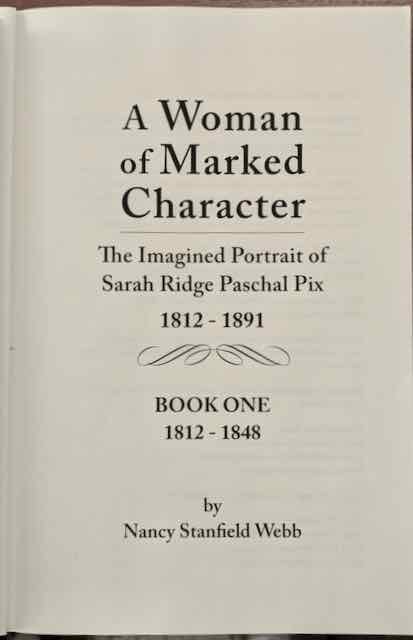
This past week I held in my hands the beautiful final print proof of Book One 1812-1848 of my two-part historical novel, A Woman of Marked Character - The Imagined Portrait of Sarah Ridge Paschal Pix 1812-1891. My 33-year-old first idea has now been realized as my best idea.
After finishing writing and having my biographical fiction manuscripts edited, last winter I began pursuing self-publishing. I chose this route rather than the usual manner of querying literary agents and hoping to be picked up, then hoping for the agent to secure a contract with a traditional publishing house, and eventual publication. This process can take years, and it depends upon a lot of hope and luck. It's a gamble. So I decided to invest in myself, and now Book One will be published on November 19th, a matter of weeks from now.
My chosen path at times has been a mountainous road, fraught with landslides and treacherous cliffs, but I arrived with my dream intact—and the final book is my design recreated by cover and interior designers whom I hired to depict my vision.
I didn't want a publishing company to design a contemporary cover for me. You see, my main character Sarah Ridge was a reader and well educated; family lore mentions her love of books. When I envisioned what I wanted my novels to look like, I saw them resting in a bookcase in one of Sarah's homes. I wanted the look of an 1800s book.
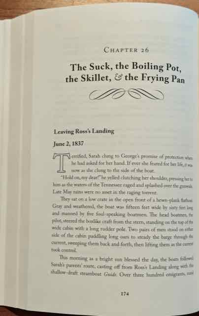
I wanted a front cover of green leather embossed with gold type and a large medallion, with creamy pages laid out in a lovely typeface, the chapter headings decorated with graceful flourishes.
Over my years as an artist who loves the process of creating handmade paper and collects leather-bound books, I knew the look and feel I wanted. But how to translate my early handmade books for a commercial, high-speed print run?
I wrote an untold number of emails to a series of three different cover designers, describing the pictures in my mind for them to translate into graphics. I would receive PDFs of their interpretations, then write more emails for changes. Finally, with my selected printer and distributor BookBaby, the fourth proof book they sent over the months of revisions was a keeper.
The interior design process was easier; through a chance referral to Los Angeles book designer Andrea Reider, she created the perfect look I wanted for the 408 pages of Book One, including maps and illustrations. Gorgeous.
Opening the book, the 60# cream paper sets off the Caslon font (a typeface designed in 1722); a large outlined "drop cap" announces each leading paragraph of the chapters; swirly flourishes decorate chapter titles and delineate space breaks on the pages. The grained leather-look background printed on matte finish cover stock—with gold lettering and medallion to simulate embossing within a gold border—is just about as close to the real thing as modern print technology can replicate, I believe.
Holding it initially, I was tempted to rub my hand across the front cover to feel the raised grain and embossed medallion. Several friends who have held the book did the same. (It's the front cover and spine I was designing to look real; the back cover, as required, tells about the novel and shows a barcode, things an antique book would not have had.)
The finale of my first idea.
I share these images now, and look forward to you, also, holding Book One in your hands. These photos of interior pages pale in comparison to the real book.
I would love to know your comments if you would share them on my Contact page.


